Summary of Results
When Project PRISM started, the team expected confirmation of popular conceptions about how migration worksin the United States; we expected to see migraations out of supposedly expensive, overcrowded states like New York and California; and correltions between tax rates and migration flows. Our data shows a far more nuanced picture of American geographic mobility than most Americans would infer from common media narratives. One, most migrants rather like their states and prefer to move within their states. Two, the reasons behind these moves would appear to be driven by factors far less abstract than tax rates. A nuanced understanding of the how, where, why, and when of US Geographic mobility would be beyond the ability of simple quantitative analysis to demystify. However, the team provides the visualizations below to help the public better see the truth through the prism of data visualization.

Plot 1 is a diagram showing the origins and destinations of out-of-state migration flows into US States according to estimates based on the American Community Survey (ACS) 2019 5-Year Public Use Microdata Sample (PUMS).
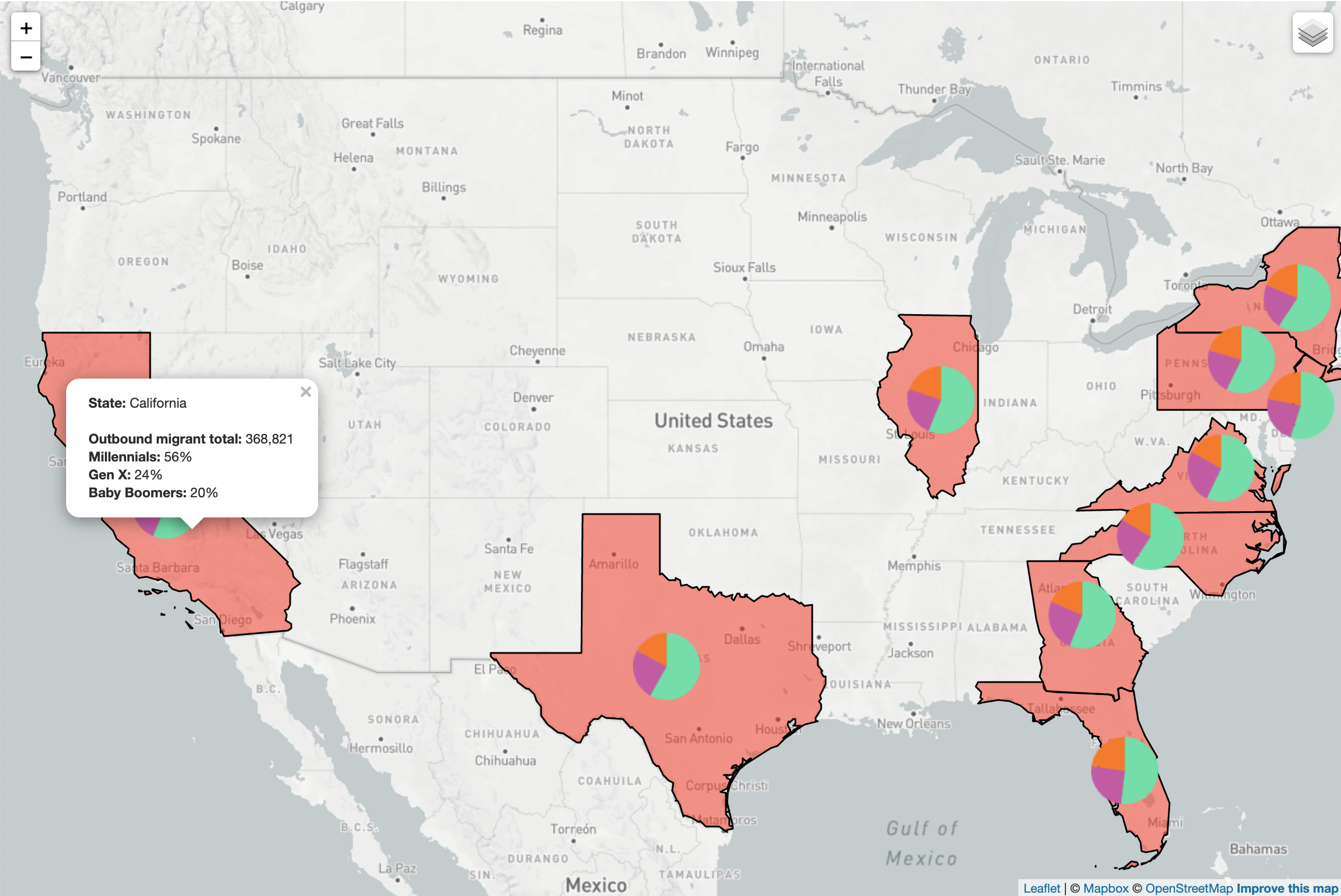
PRISM's Atlas of US Migration Data shows the Top Origin and Destination States for US migrants and shows the demographic data underlying the numbers

Plot 2 is an interactive scatterplot where multiple factors that may affect migration are compared to outmigration or inmigration numbers. Out of multiple factors, the user may choose which ones to view to see how they are related to migration numbers. This scatterplot makes it possible to look at many push and pull factors and make an informed opinion about what drives migration in America.
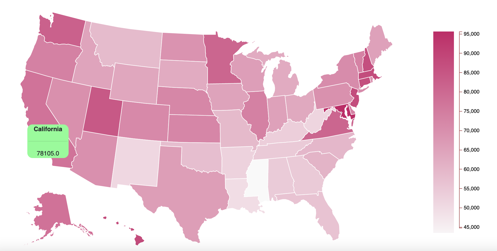
Plot 3 is a choropleth map of the United States that displays the median income in each state. This map does not show migration numbers; vut allows the user to infer whether economic conditions may drive migration.